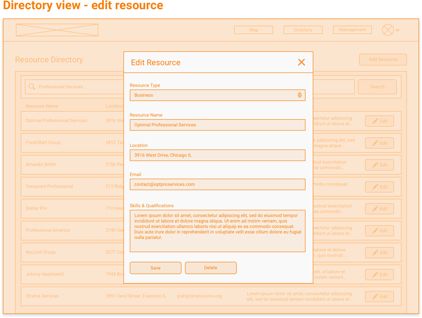
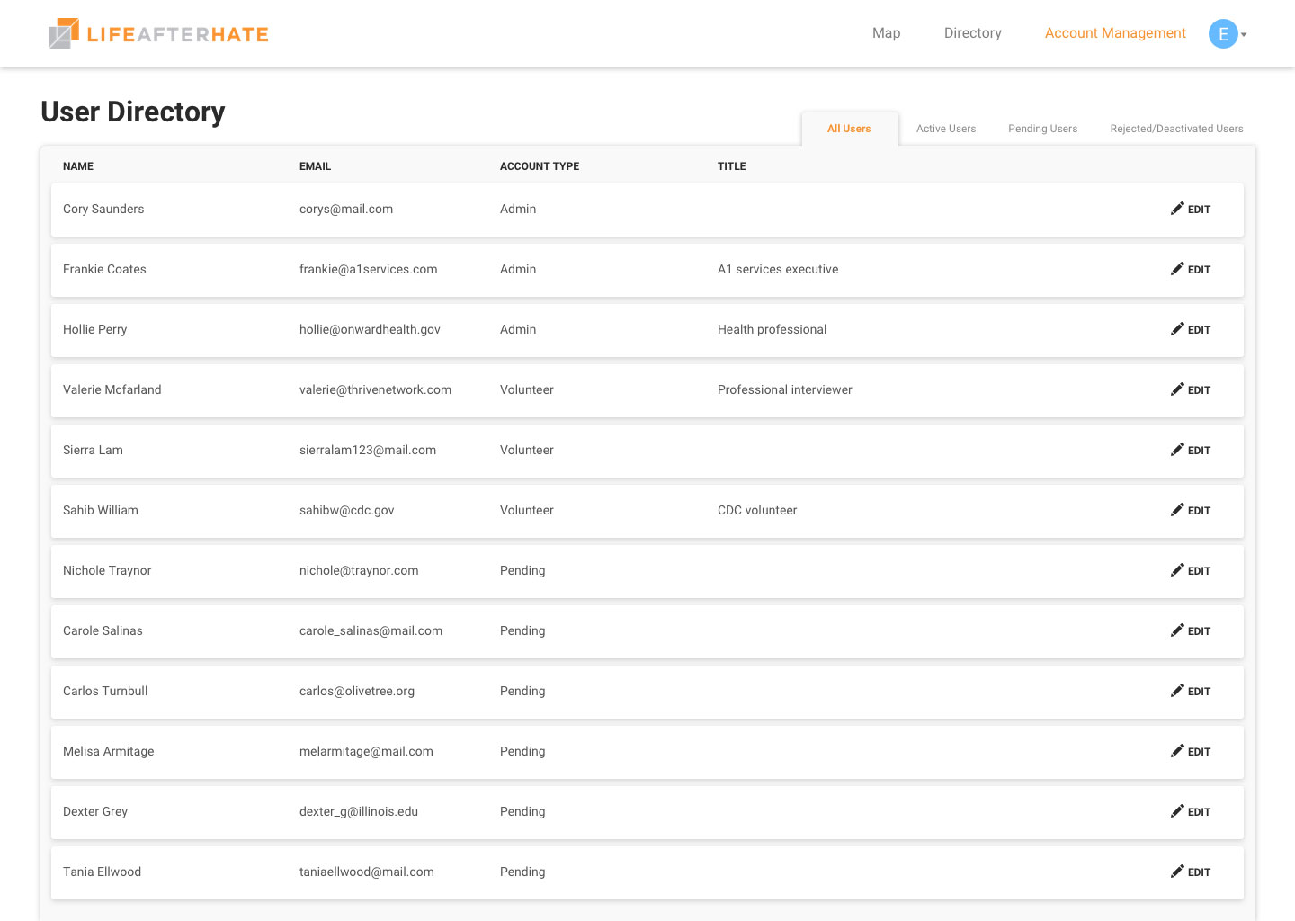
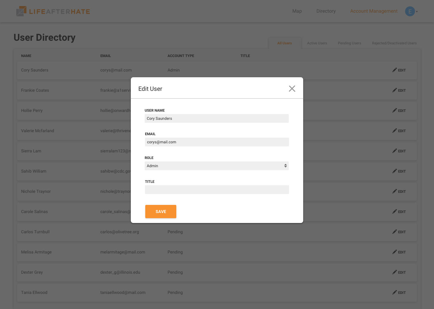
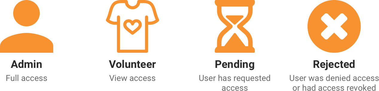
All the mockups and designs displayed throughout this case study are from an admin point of view, meaning that there will be the option to edit and the account management page will be accessible. For volunteer accounts everything is the same except the management tab, edit button, and add resource button will be hidden.
Key Problems
There were quite a few problems we really dug deep to solve. I've outlined some of our more impactful design decisions we made to provide a better user experience.
Optimizing the search experience
Problem
When searching, we had 3 different types of data that factored into the search ranking: location, tag, and the keywords. Having 3 different text inputs would make searching take longer. How do we keep the search form user friendly while still collecting necessary data to make a search?
Solution
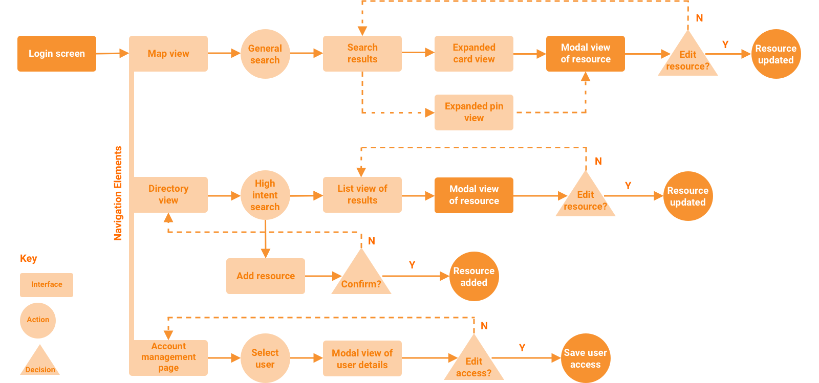
We had to go back to the differences between high-intent search and general search. We had already decided that high-intent search would be on the directory view page, while the general search would be on the map view page. So we broke down exactly what we needed to make both searches.
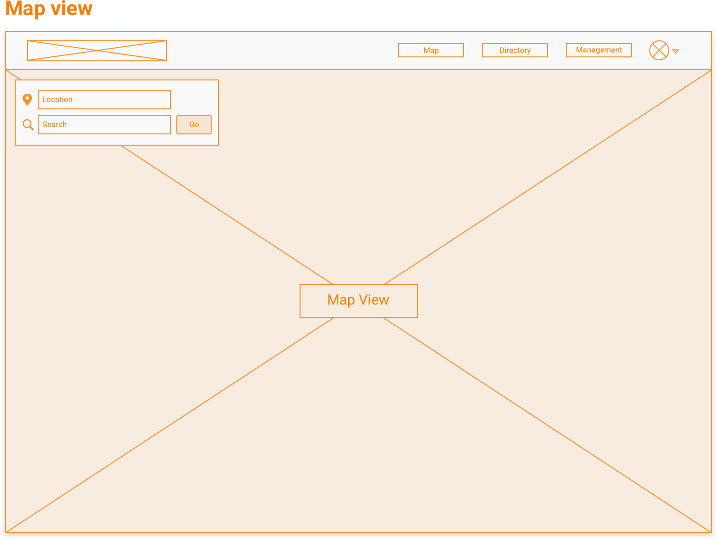
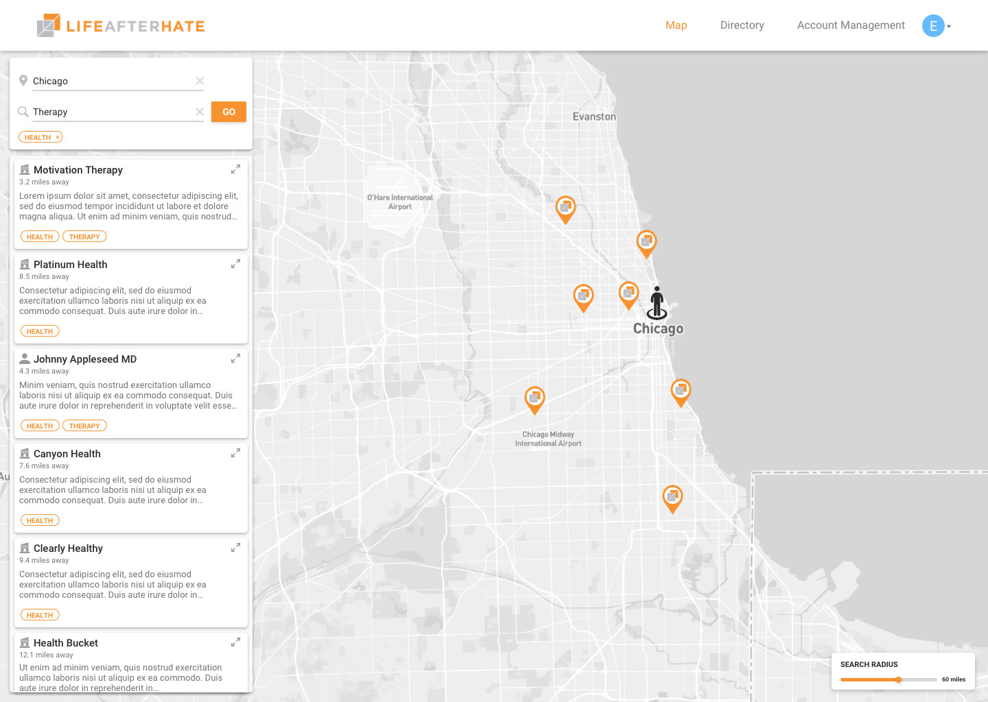
General search: Of the 3 different possible inputs, we found that for general searches LAH staff would use location and either keywords or tags. Location was a staple for this type of search, so we gave it a dedicated input field. Following principles of Postel's Law, we made the second input highly versatile by accepting both tag and keyword queries. Postel's Law states that you should be be liberal in what you accept, and conservative in what you send. We keep the search open ended and kept results relevant to the given search query.
To make this work, we created a weighted search algorithm that weighs keywords found within resources. Based on research and user needs, we created a search ranking system with the following components contributing to the rankings:
- Name of business
- Point of contact
- Tags
- Matches in description
- Matches in notes
Each components has a weight based on how important we found them when displaying search results.
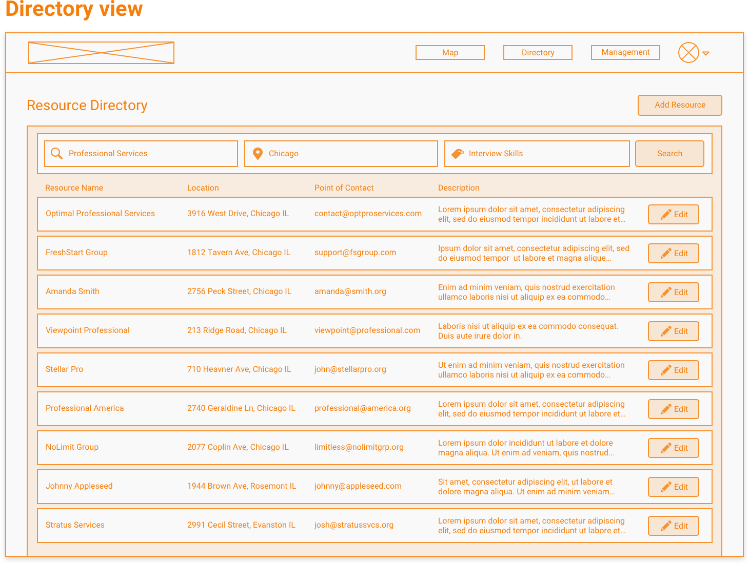
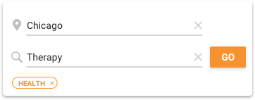
High-intent search: Because high-intent search is highly specific, we needed to use all 3 data components: location, tags, and keywords. These 3 independent fields give the user a high level of control over searches. The user still has the choice of leaving any field blank, but all options are provided.
We used a slightly modified version of the keyword scoring above, with the only difference being that the tag can be explicitly defined. This allows the user to really narrow down search results.
We revised the location input field to be extremely forgiving by accepting many location formats. Queries as simple as just "Chicago" or as complex as "600 E Grand Ave, Chicago, IL 60611" would both be accepted. With some extra engineering work and some research into basic search algorithms, we were able to optimize the user experience in both search cases.
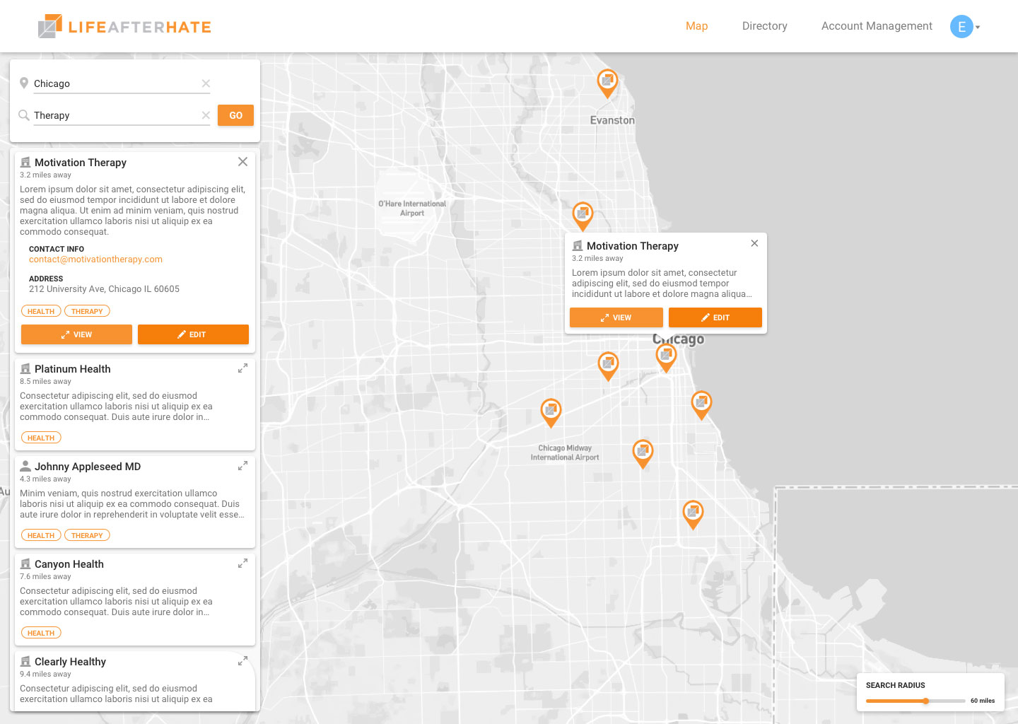
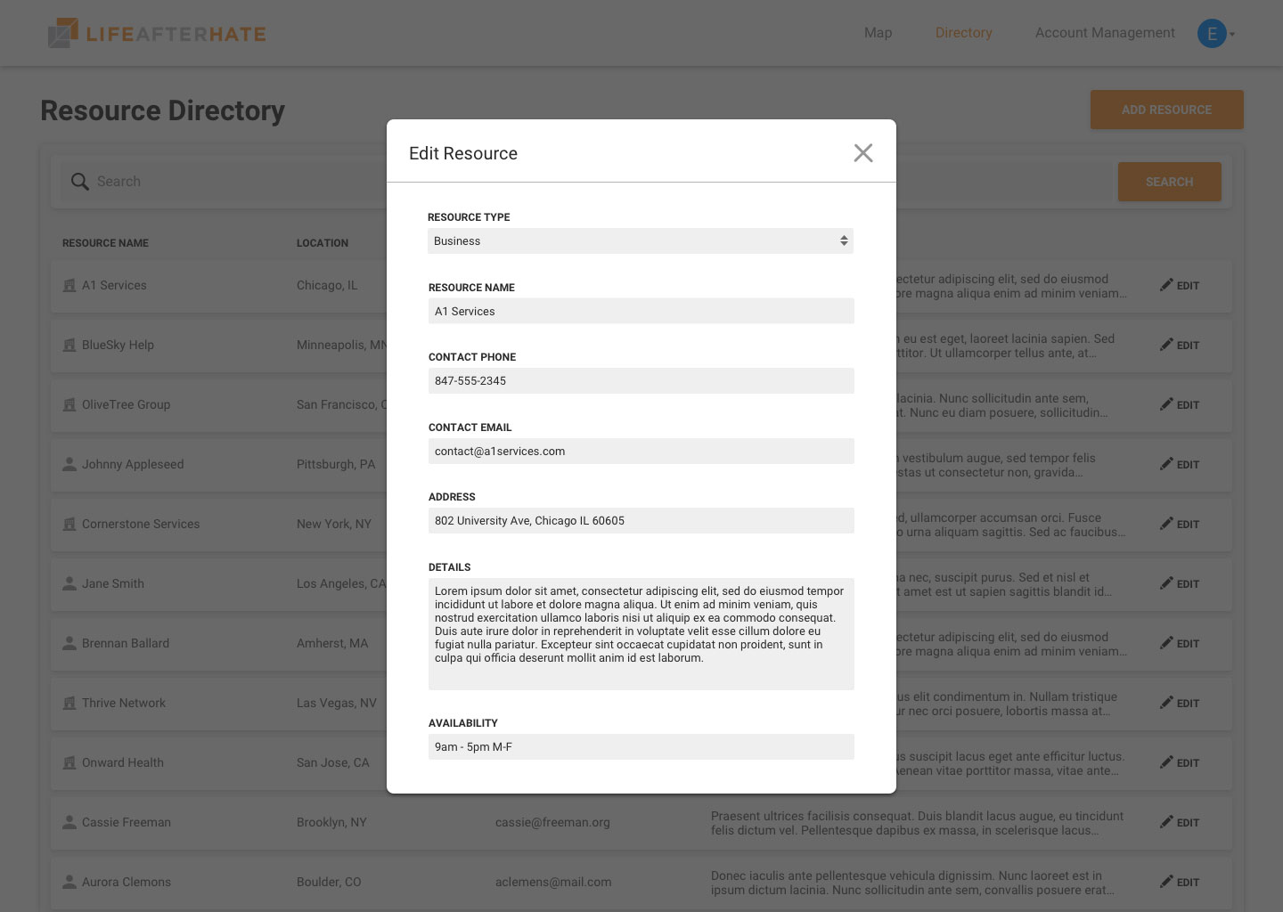
Finding the best way to present resource data
Problem
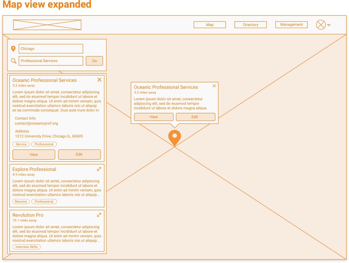
LAH's resources are very complex and contain a lot of data. When displaying many resource cards on the map view, we needed to find a way to display the data in a digestible manner so users can easily skim and request more details.
Solution
LAH's resources are very complex and contain a lot of data. When displaying many resource cards on the map view, we needed to find a way to display the data in a digestible manner so users can easily skim and request more details.
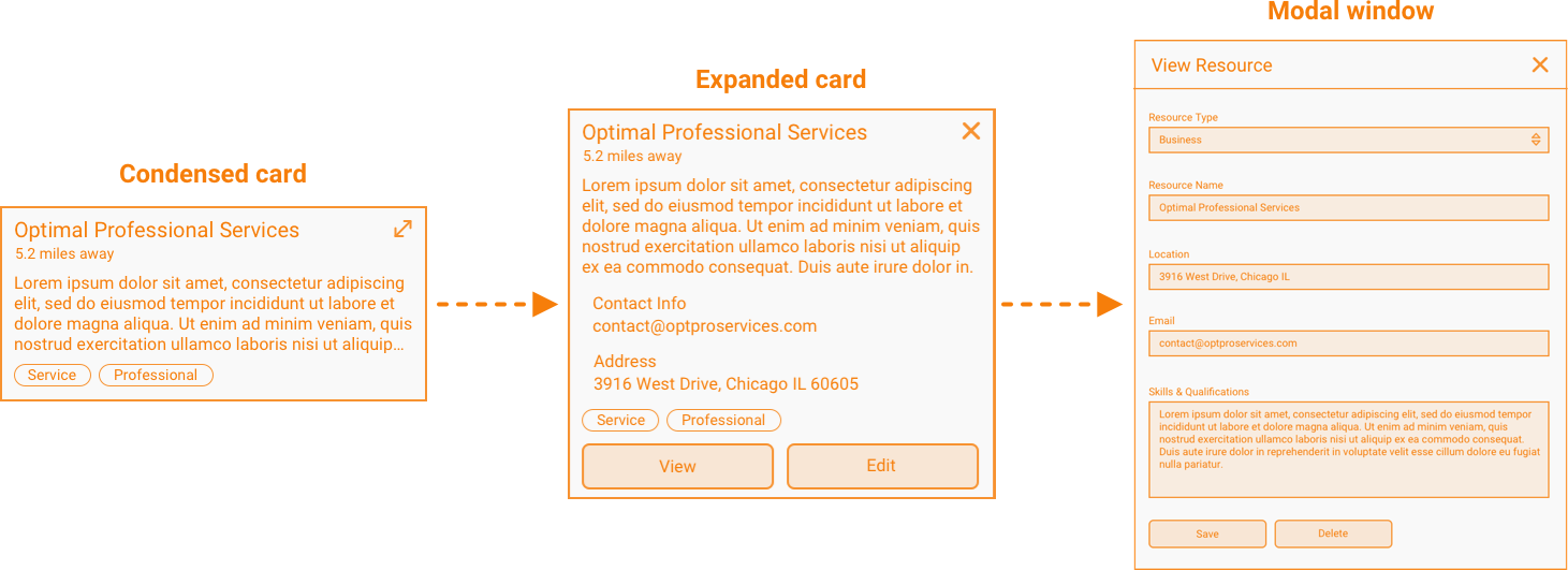
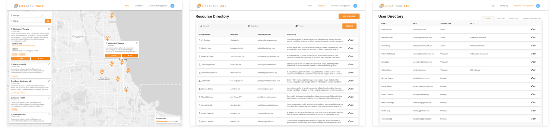
Information is progressively displayed through 3 states:
condensed card → expanded card → modal window
Each progressive level will present more data, eventually displaying all details when you reach the modal window. This progression is representative of user behavior on the map view. When browsing for an item the distance, name, and tags are generally the most important, with a description to add some context. Then if you want more, expanding the card reveals relevant information to give to the former. This card would include details such as full description, email, and address. More specific results are listed on the modal window if necessary. But we kept all the most relevant information within one click.
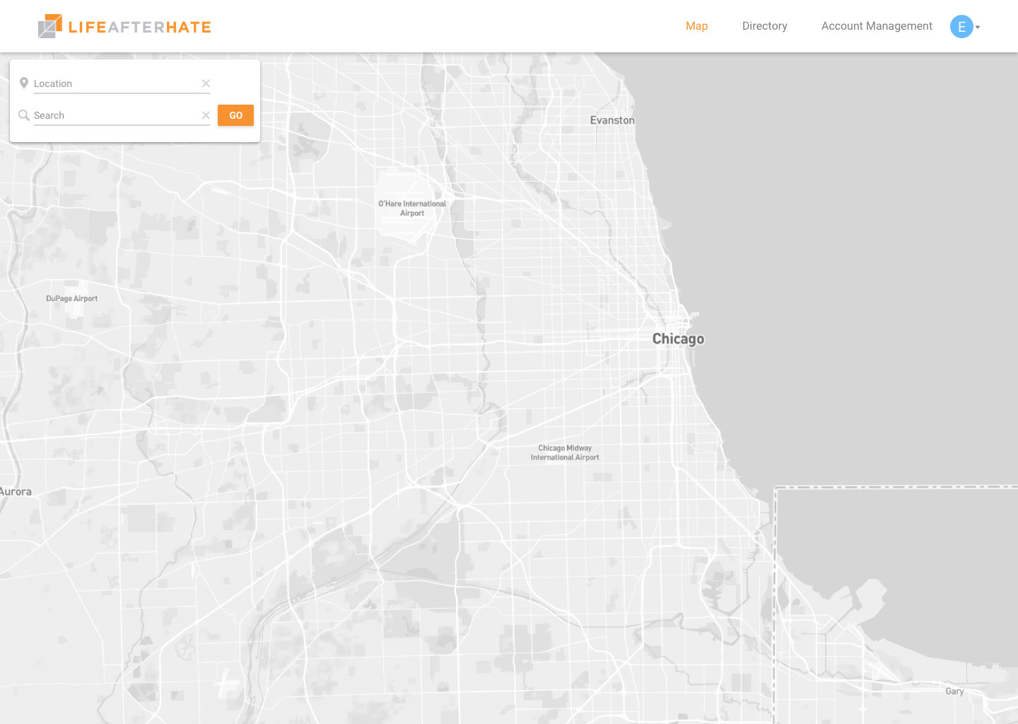
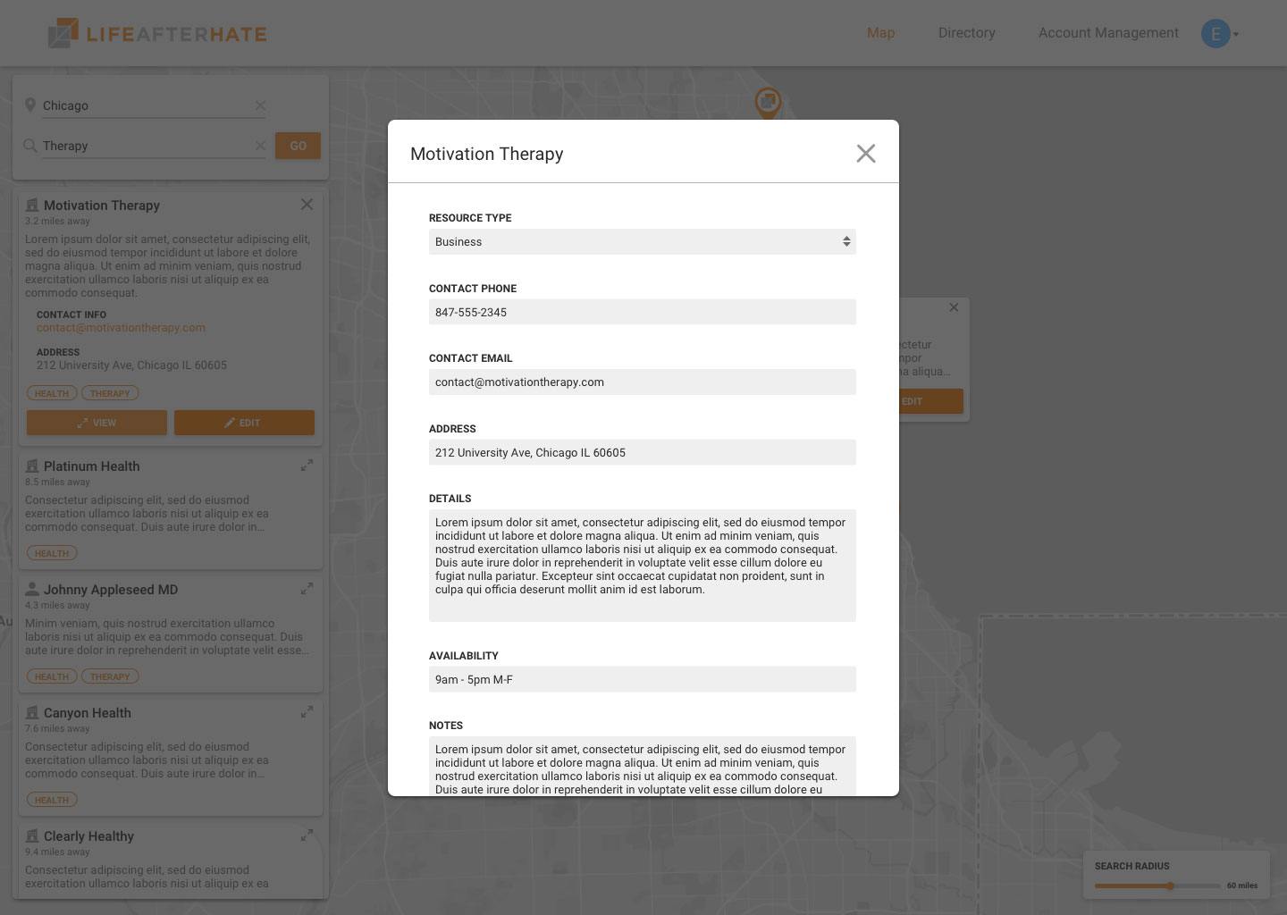
Building the map view for power users
Problem
Currently our map view is focused on slowly guiding you to the resource information you need through progressive disclosure. This method works great for users who are not familiar with the platform, but for some users (LAH staff) this application will be used extensively on a daily basis. The staff will be extremely familiar with the resources and the use of progressive disclosure will unnecessary in many cases. So how do we make our card design more user friendly for power users?
Solution
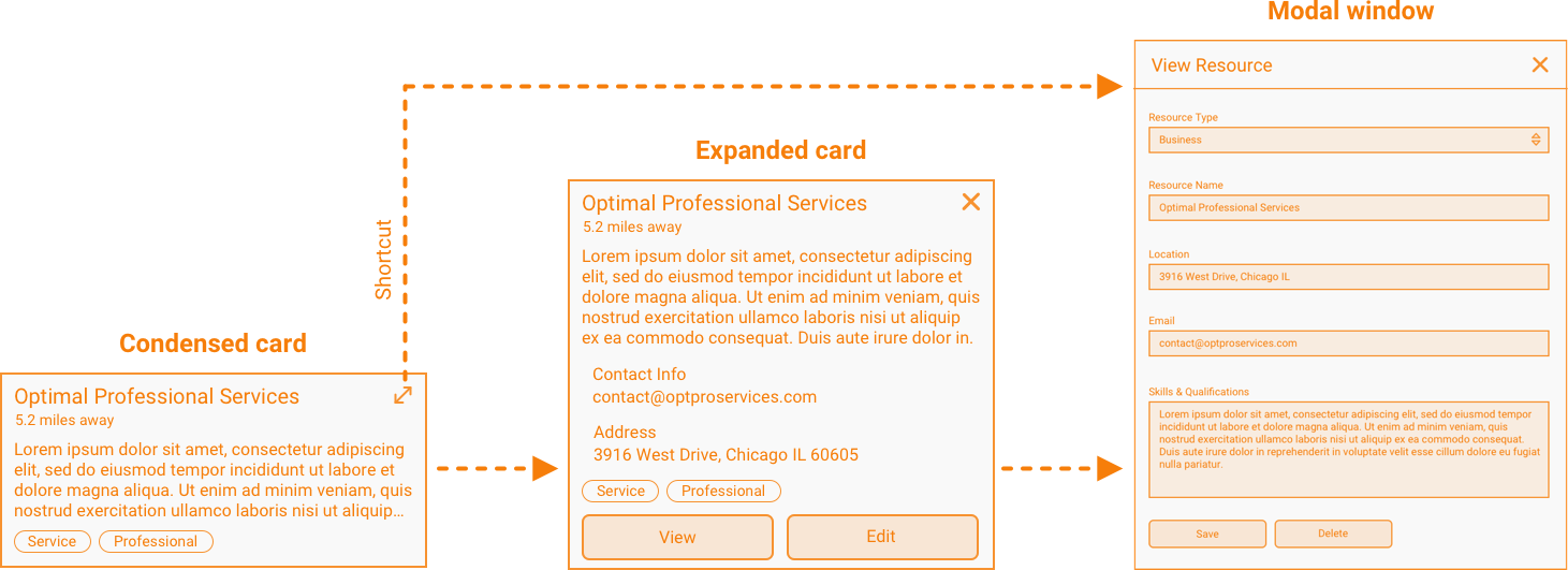
We need to implement a feature that the power users can utilize without interrupting the user experience for other users. The LAH staff (power users) are highly familiar with the resources because they are the ones who most likely are in contact with them and added them to the platform. Often times they know some specifics of a resource, they are only looking it up because they need a specific detail. Because of this, the intermediate step of expanding the card is unnecessary. Power users want to get directly to the modal window.
To cut the expanded view out of the process, we add a non-intrusive "shortcut" button in the top right of the card. This button takes you directly to the modal window. This button disappears and is replaced with a "close" button when the card is expanded. By doing this, we give the option to reduce the number of clicks it takes to go from condensed card to modal window from 2 to 1 click.
User Testing
Since our project spanned 2 semesters, we were able to invest time and resources into user testing. We had most of the main components built out in the fall semester (map view, directory view) which allowed us to spend spring semester pinpointing usability issues with ample time to revise.
We primarily did user testing with the LAH staff and people who did not have a deep understanding of the application. We asked the users to try and complete certain tasks and documented the processes that each user followed to reach the end goal.
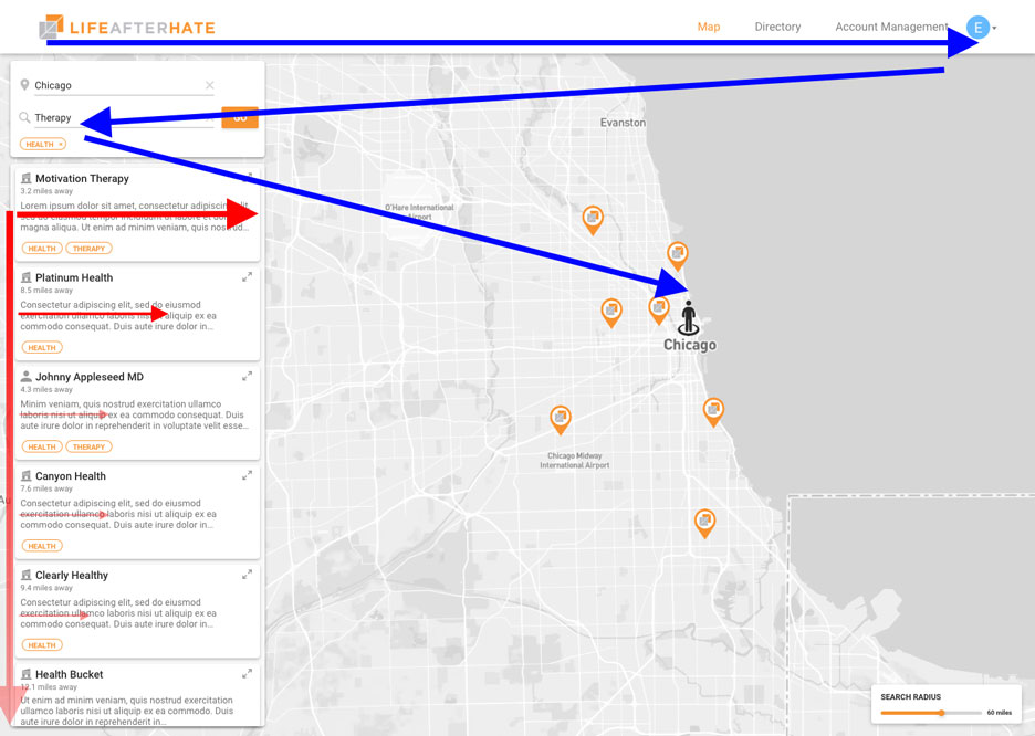
Through testing, we found that a lot of users were clicking on the "tags" of a resource. After further research, we found that the tags resembled buttons. They had an outline and used the same bright orange accent color as the buttons and map pins, both clickable objects.
Our initial solution was to revise the design to have no border and use a more neutral color, but instead felt there was a better way to address this. The pilot users were trying to filter by tag. They needed it to complete their task and were left frustrated when it did nothing and were forced to plan B. We left a lot of time to work on usability issues, and decided interactive tag filtering could be added to the scope without any adverse effect to our current timeline.
I already went through the reasons for leaving a dedicated tag filtering input on the map view search in the "Key Issues" section above. Despite that, we decided that tag filtering somehow needed to be incorporated but without compromising the simplicity of the current search experience.
We took a look at the user behavior and noticed that users were only clicking on the category tags after they couldn't find what they were looking for in the top results. For most users, filtering becomes important after they have started scrolling through the resources and want to look at related resources. Going back up to the search bar and typing the tag in would be more work, when the user could simply click on the tag.
This map view is being used for general searches, meaning that they often will not have a tag in mind unless they come across it in the search results. If they are looking for a specific tag, they would search in the directory view.
Having a clickable tag acts as a "recommended" section to find related resources. So the implementation we designed was to have users click on the tag they want to filter by, and this would be added under the search bar and re-trigger the search.
By adding this feature we will make it easier to browse for resources. This may be a little bit less useful for power users who know exactly what they are looking for, but when this product is expanded to volunteers we expect to see this feature utilized more.
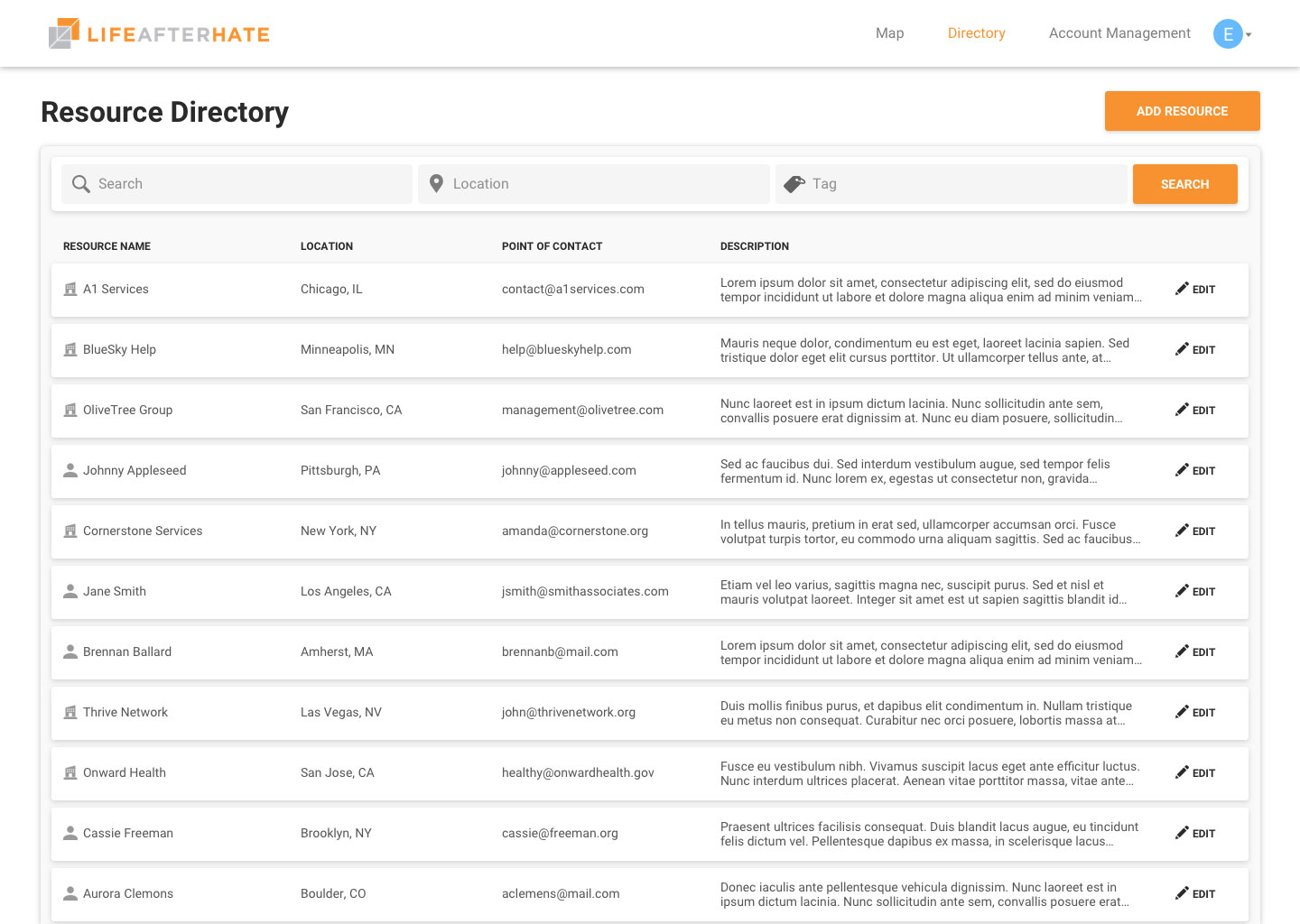
Final Product
After all of the user research, prototyping, and user testing we came to our final designs. The web app was created over 2 semesters by 13 developers using React, Redux, Node.js, and MongoDB.