UIUC’s App for Bar Culture
To begin, Cover Me was an app that was initially started by John Chomiak who sought to publish cover prices and drink deals on an app. The cover prices would be crowdsourced by various app users. The convenience of having an app that displayed cover prices and drink deals was something that UIUC could use, especially considering how dominant bar culture is at the University.
John built the initial prototype of the app, and wanted to launch it at the beginning of the Spring 2019 semester. There was one problem though. The app just wasn’t polished enough. It got the job done, but there was a lack of brand for the app and it just didn’t have a very fresh or professional appearance. Which is where I come in. John came to me for help with the branding and the design of the app.
Building Cover Me to Last
Apparently, this was not the first time this idea had been brought to UIUC. Many people had tried to create apps for drink deals and cover, but none of them really stuck. Whether it was lack of traction, or bad business model, none of them stuck. These bar apps would pop up, only to disappear within weeks.
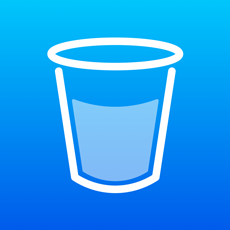
We wanted to avoid this. I took a look at some of the apps that had flopped, and had noticed a trend among the apps. They all lacked great design. The technology was often great. The app would work perfectly, but the design and branding just lacked. They weren’t fun to look at or use. So we sought out to create a brand that we would make recognizable everywhere. Which led to a brand that touts a bright blue gradient with a simple white cup.
Yes, I know this looks a lot like the color palette of my previous project Grubyr. Actually, an exact copy. I honestly loved working with that color scheme, and since Grubyr hasn’t been doing much, I decided to borrow the color scheme :)
This logo is hard to miss. It is very bright and carries the same characteristics as a lot of other tech logos.
Building a Great User Experience
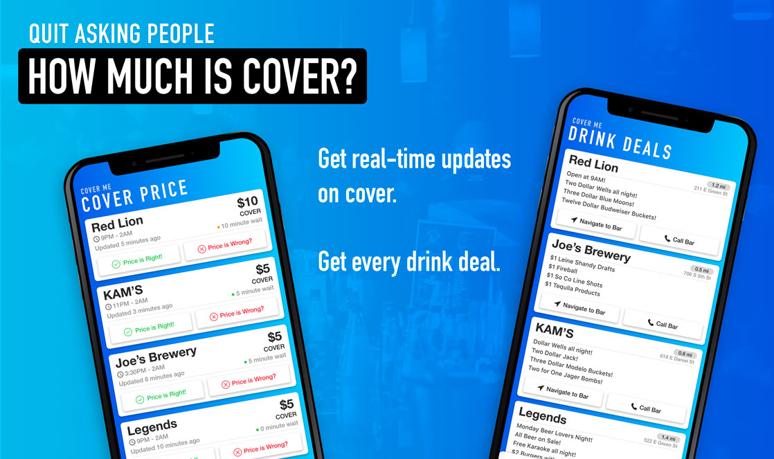
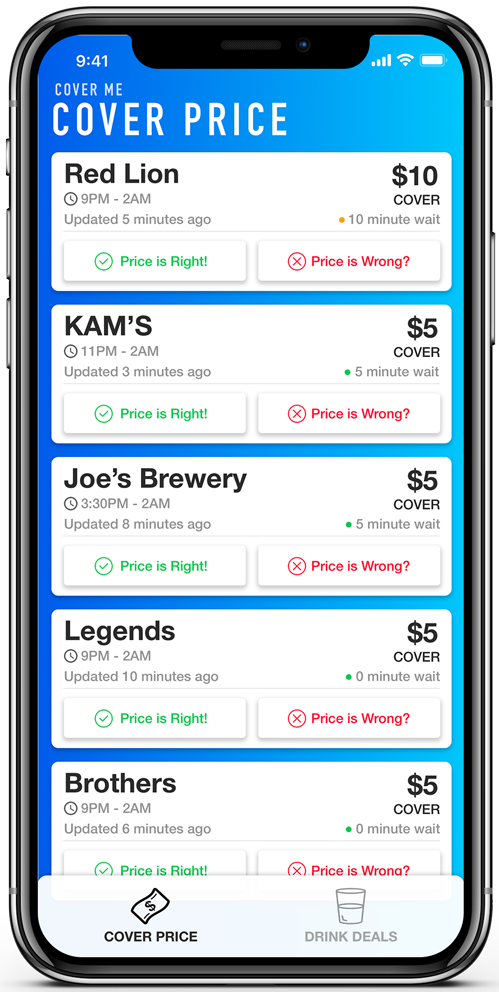
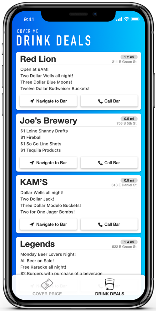
The next task was actually designing the app. Chomiak had an initial idea of these cards that displayed the cover price for each bar. I decided to take this idea and run, splitting the drink deals from Cover Price via tabs at the bottom.
Based on our goals we had a few primary goals for our app regarding the User Experience:
- Be extremely quick to use
- Require as few clicks as possible to accomplish a goal
- Be fun and satisfying to use
These goals all had their own reasoning behind them. We wanted the app to be quick and require minimal effort to accomplish a task, given that the user might not be 100% focused (pregames) when trying to look for information.
We wanted the app to be fun to use because we ultimately needed to collect data regarding the cover price at bars. We really did not have the resources to incentivize contributions to reporting the cover price through our app, so we needed to make it fun to get users to report cover price.
Building the User Interface
We wanted to make the app appear as modern and clean as possible, using many characteristics of material and flat design. The result was a colorful gradient background and space separated text using the DIN Condensed font.
Building the Card
The card design was ultimately going to be the main component of the app. It would be what users spent the longest time looking at, would contain all the information and actions, so it was only natural that this took the longest to plan out, with many design concepts and countless adjustments.
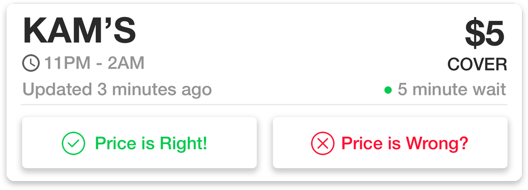
The card needed to be as compact as possible, while still keeping the information well spaced to keep it readable. I heavily utilized font size, color, and weight to separate and highlight data for the user. The top of the card was separated into 3 different lines and two columns. The top row was in a larger font and was a darker font, highlighting the two most important pieces of information on the card, the name of the bar and the cover price. Below these, secondary and less important information was displayed in a smaller gray font. This included the hours of the bar, last update time for cover, and the line length.
There were also two buttons on the bottom of the card for selecting if the cover price was correct or incorrect. Not much to say about these buttons, but I spent a while making sure these buttons were big enough to press easily while also making sure the cards didn’t get too tall.
It was definitely a challenge keeping everything compact enough while also making sure information was readable.
How do you get more users to submit cover price?
This was the biggest question we had to ask ourselves when deciding if this app was even viable. We went through lots of options. A lot of them required us to somehow reward the user with money or perks we just could not offer.
We tried to leverage a lot of different things to try and answer this question throughout our brainstorming. The main answers came in the form of marketing and UI. In terms of marketing, we wanted to make this a community platform.
This idea came from the community model that Waze uses. Users will report locations of police cars lurking to alert other drivers. Similar to how GasBuddy works too, when you get gas, you report prices through the app. This idea that you are apart of this community where others help you out, and you help others in return. It is drivers vs the cops, drivers vs gas stations, and in our case, students vs the bars.
Bars don’t want their cover prices posted. It deters people from coming to the bar when lines get long and cover price goes up, so they try to conceal it. Obviously this is detrimental to people who want to go into the bar, so we wanted to encourage users to help each other out, and submit cover prices.
The UI was also key in getting users to submit cover price. Two components were important in this:
- Make a UI that is satisfying to use
- Making sure submitting cover price could be submitted in as few clicks as possible
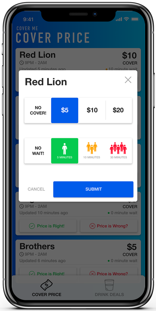
The first component of making a satisfying UI was based off of this principle that people LOVE to hit buttons. There are so many ways to make buttons fun to press. Haptic feedback, animations, instant feedback, enticing design, you name it. We tried to employ all of them. When you click on the button, you feel a small buzz and are immediately met with a modal window that has even more buttons that animate on touch.
I modeled the buttons in the modal window after keyboard keys, with drop shadows, rounded corners, and a nice square shape that creates this all too-familiar representation of a keyboard button that you just love to press.
While designing the report cover procedure to mostly consist of buttons made the UI very fun to use, it also served a second purpose. Having this procedure require as few clicks as possible was among the benefits of buttons. When submitting cover we also considered having the user type in the cover price. We quickly realized that this was unnecessary.
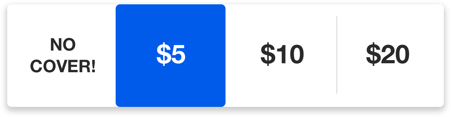
The user would have to launch the keyboard, type the price, then submit it. It was tacky. We realized that bars set their cover prices to follow full bills. Historically, the cover price has only ever been $5, $10, or $20. These are all full bills, chosen specifically because these are easy amounts to collect at the door. We decided these could be easily represented as 4 buttons, which would effectively reduce the number of clicks from ~3-4 to just one hit of a button.
We added an optional feature where you can submit the line length. We followed the same approach when designing these buttons, with a huge stress on color and icons to represent different line lengths.
Designing the Drink Deals Page
This page posed less of a challenge to design. Effectively, the only thing that we needed to display was drink deals and the bar name.
We ended up going with the same card design for consistency and also included distance to bar, along with navigate and call functions to make things easier for the easier to find. There isn’t much to say about this, I just tried to stay consistent with the design from the other page. Keeping the same font sizes and button sizes and design.
Preparing to launch our Marketing Campaign
With second semester around the corner, and the app fully designed and published, it was time to plan the marketing campaign.
We did not have much money to dump into advertising, so we had to be smart with the methods we used to advertise.
We did have a few key advantages though:
- Close physical proximity to our target market
- Community very connected on social media
- We were part of the target market
These advantages would help shape our advertising plan. We were targeting UIUC here. This means there were so many ways to reach our target audience, through social media, print media, or even just direct advertising.
We could utilize advertising space all over campus to post flyers, and hand out stickers in common spaces. We would post advertisements for the app on social media, and ask our friends to do the same. All the students follow each other on social media, so in theory, it should be extremely effective. We had the advantage of being so close to our target market, this helped us spread the word through friends. We utilized Facebook, Reddit, Instagram, and Snapchat to help reach as many people as possible.
This helped us form a very cheap advertising plan. Where we effectively only paid for the flyers and stickers that we ended up printing. While it was cheap, it was a lot of work. We would spend a lot of time putting flyers up, handing stickers out, and telling organizations about our app.
We launched our marketing campaign, and within one week of launch, we had over 2,300 app downloads.
Creating the Marketing Material
I was in charge of creating the marketing material for the campaign. Some of the materials that needed to be designed were:
- Posters
- Social Media graphics (banners and post content)
- Stickers
- Feather Banner graphic
- App store display screenshots
- Landing page (website)
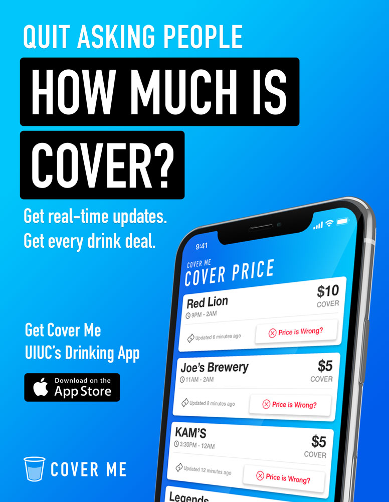
I will focus primarily on the design of the poster, because this was our main form of advertising and most of the characteristics carry over to the other graphics I designed.
The aim of the poster was to grab the attention of people walking around campus. We had to not only get people to notice it, but also grab their attention and get them to walk up to the poster.
The color scheme lent itself perfectly to this. The vivid blue gradient were perfect for a background color that would stand out on any wall. After we got their attention, their eyes would be drawn to our large header text, trying to get them interested enough to walk closer to the poster.
This was the eventual design of the flyer. With the app displayed on an iPhone X mockup, and the call to action to download on the app store, there was a lot of information displayed in a sight path that flows in a “Z” pattern down the flyer, eventually leading them to the website to download the app. The poster was designed to follow the same theme as the app, with a bright and sleek feel to it.
This poster was put up everywhere, and seemed to be a significant source of our downloads since we had so many download referrals coming from our website, which was only on our posters.
Gaining Traction
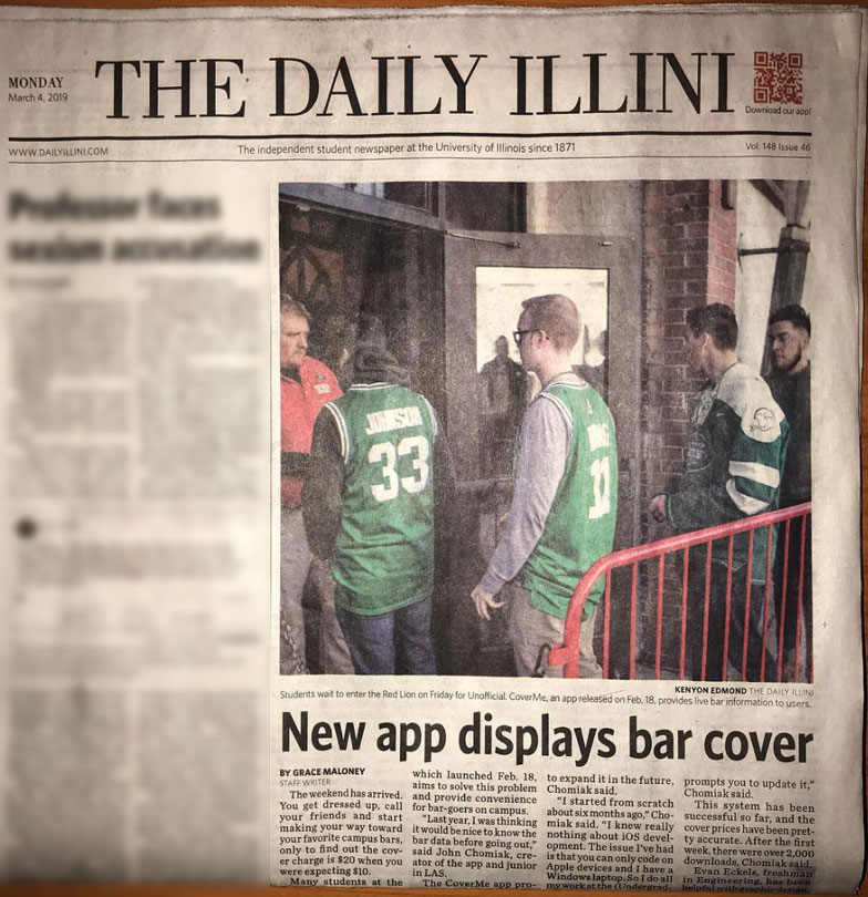
Through our efforts, we built a large user base on our app. We had over 5,300 downloads and over 130,000 app sessions during our launch semester. We caught the attention of people everywhere, and were featured on the front page of The Daily Illini.
We will continue pushing our platform to be better and providing more to the users. Overall it has been a great ongoing project to work on, and has given me a lot of experience with data analytics and customer feedback to help improve the app and the design behind it. It has given me a lot of practice working with data to help track the usage patterns within the app, something I cannot really do with some of the other things I have designed, and that is an invaluable experience for me, as someone who is looking to get involved in the UI/UX field.